
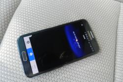
 Subaru Starlink smartphone app. Click image to enlarge |
Article and photos by Jacob Black
It’s no secret that Subaru’s infotainment controls and human machine interface have lagged behind other manufacturers in recent years. The simple fact is that radios, multimedia systems and telephony systems weren’t a priority for the marque that prides itself on rugged, tough, versatile capability and all-wheel-drive handling.
Unfortunately for Subaru, those systems were a focus for their competitors. And thus the frank admission during the launch of the 2015 Subaru Outback that Subaru was subpar in this area. Was. Not anymore.
The system unveiled in the Outback is a dramatic improvement.
Basic Overview
In base trim, you get a 6.2-inch touchscreen with four hard buttons and two knobs for volume and tuning as well as a 3.5-inch TFT screen nestled in the instrument cluster. In top spec there’s a seven-inch touchscreen with six “pseudo-button” touchpoints and two volume knobs, plus a five-inch TFT screen in the instrument cluster.
All the usual stuff is there in both models – aux/USB input, a CD player, satellite radio – but the upgraded model also gets a micro-SD card slot. Both systems have an integrated back-up camera, but only the seven-inch system gets navigation.
The 6.2-inch system has audio, phone, apps and setting options on its home screen. The 7.0-inch system also has navigation, and vehicle information screen. The basic system used tabs to separate menu items under the settings screen, while the advanced system uses icons to access submenus. The top-spec system also allows split-screen functionality.
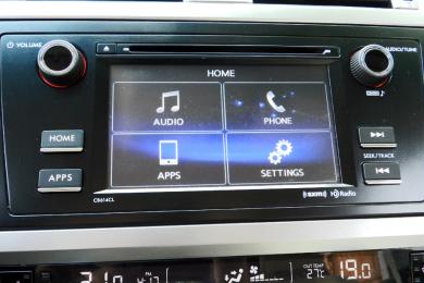 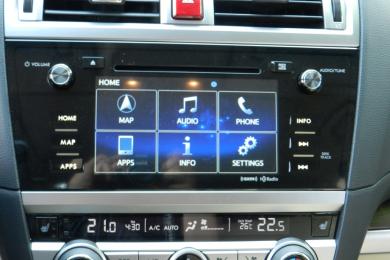 Subaru Starlink system versions. Click image to enlarge |
The smaller and simpler version is slightly more responsive and faster than the upgraded version. Both systems are elegant and attractive, with customizable background colours for the fashion-conscious set. Gone is the rickety old radio or tiny screen wedged awkwardly into the dashboard – this system is among the best-looking around.
Some things take two presses where other systems take just one, sacrificing quick access to multiple functions for a cleaner look and feel but paradoxically, that actually has made it easier to use.
If the icons and buttons look familiar to you, it might be because Subaru shares the same basic operating system and software as the system used by Toyota with some key differences. For example, the Starlink mobile app.
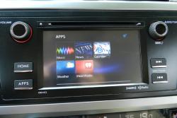    Subaru Starlink Apps menu, Phone menu, Bluetooth pairing screen, Quick Message presets. Click image to enlarge |
Starlink App
Subaru also offers the Starlink smartphone-linked app that allows you to review news, weather, your calendar and play music from the internet via your smartphone. The data is transferred through your data plan on your phone, and the information is transferred to Subaru’s screen. It involves downloading the free Starlink app to your phone, but once the initial syncing is complete, it is surprisingly easy to use and fast.
More apps will be made available for Starlink as time goes by.
There is a nanny-state warning screen which can be programmed to not appear again. Starlink app functions are accessed via “Apps” in both systems.
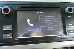
Bluetooth Telephony
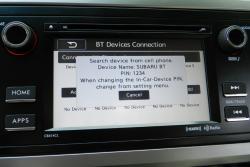
I have been vocal in the past about Subaru’s sketchiness when trying to link some phones to their cars – but in the new version I had no issues at all. The system grants easy access to the Bluetooth setup menu via the Phone or Settings menus, and adding/deleting a device can all be done via the touchscreen. You do still have to initiate the pairing process from your phone which is a shame as many manufacturers have now sorted out car-to-phone pairing, but the system is fast to connect and up to six phones can now be stored.
You can also connect your phone by voice – but not while you’re driving. The touchscreen method is faster.
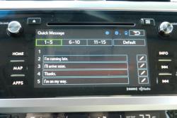
Both systems share the same setup and pairing format, but the upgraded version gives access to text-to-voice functionality as well. It will not only read messages aloud to the driver, but allow you to respond via 15 preloaded messages like “LOL” or “On my way”.
Ergonomics
Because Subaru has opted for a cleaner look on the dashboard you do still need to get to most secondary functions with two button presses – but in the base system it’s likely you’ll want to leave it on the audio display most often anyway. Leaving a volume knob and a tuning knob, as well as two buttons for seek means the traditional user experience of the radio is not interfered with, and it’s fast. Tuning and volume knobs seem always to respond better than sliders and touch because you can control the pace better. Want to turn down the radio quickly? Turn the knob quickly! Want to step from Eighties on Eight to Nineties on Nine on Sirius? Turn the knob just one click, slowly. Want to leap from Nineties on Nine to Backspin (Channel 46) – spin the tuning knob fast.
 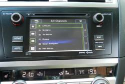 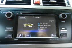 Subaru Starlink media sources list, satellite radio channel list, playback display. Click image to enlarge |
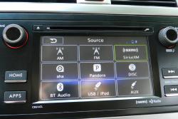
Volume and seek are also found on the left-hand spoke of the steering wheel, as is the source button. That’s handy, because to access the list of sources on the touchscreen you first have to hit the “source” button on the touchscreen – you can’t simply click the tab or icon for the source you want as you can in some cars. Telephony controls and voice command buttons are also on the steering wheel, and the voice commands are incredibly intuitive. You can also override the explanations and tutoring given by the system and input information quicker by pressing the voice button and speaking.
The seek button on the wheel scrolls presets if pressed once, and seeks the next channel if held for a second.
By putting functions like “source” under its own subpage, Subaru has increased a level to the system that some won’t like, but it has also allowed them to make the icons larger, and therefore easier to access while driving.
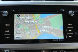
Navigation
The navigation system has fairly simple map graphics, but Subaru has done an excellent job of cleaning up the display for the important thing. On the main screen without guidance, the zoom buttons are large and well-separated, with the menu button also easy to get to.
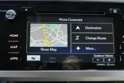  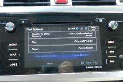 Subaru Starlink navigation menu, map view, address input. Click image to enlarge |
Inside the main menu, the main functions, traffic information and destination, are given priority with secondary commands under another submenu accessed by the “More” button.
Inputting addresses is easy, but is touchscreen keyboard only.
Advancements
Where previously the back-up camera image was projected into the screen found in the pod atop the dashboard, now it is displayed in the main touchscreen. The result is a far larger and crisper image when reversing.
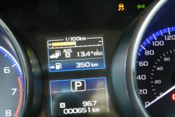
The vehicle displays that used to be housed in the pod on top of the dash is now moved to a TFT in the instrument cluster. It provides a better hand-eye link between the steering-wheel mounted information buttons and the screen itself, which is particularly useful for new users of the system.
 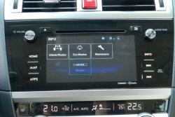 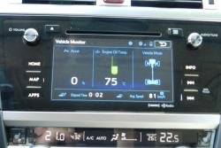 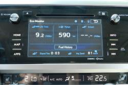 Subaru instrument cluster trip computer, Subaru Starlink Info, Vehicle Monitor, Eco Monitor. Click image to enlarge |
On the two higher trims, the larger, more interactive vehicle displays like real-time torque distribution, eco-monitor and maintenance information are now found under Info on the seven-inch screen’s Home menu. These are better-quality images, larger, and in the main viewing screen.
The new system has larger touchscreen buttons and better button controls for less-distracting experience.
It’s sometimes hard to really pinpoint exactly how an HMI and infotainment system is different from any other – on paper they have the same or similar functions, and the general approach to operation is often very similar. But when you have a case like this one, where the difference between the old and the new is so stark, it becomes clear how much a good system can enhance the appeal of a car.


